
A Very Peri Bedroom: Home decor ideas inspired by the Pantone Color of the Year!
Playful, fresh, versatile and perhaps a not-so-usual pop of decor color.
At least that’s how I’d describe Very Peri, also known as PANTONE 17-3938, and the 2022 Color of the Year by The Pantone Color Institute, which has chosen the Color of the Year for almost a quarter of a century.
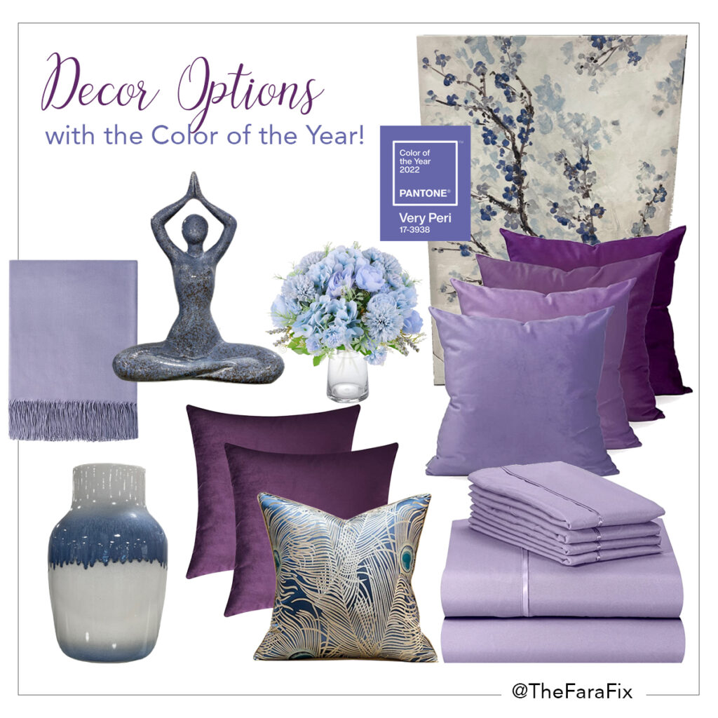
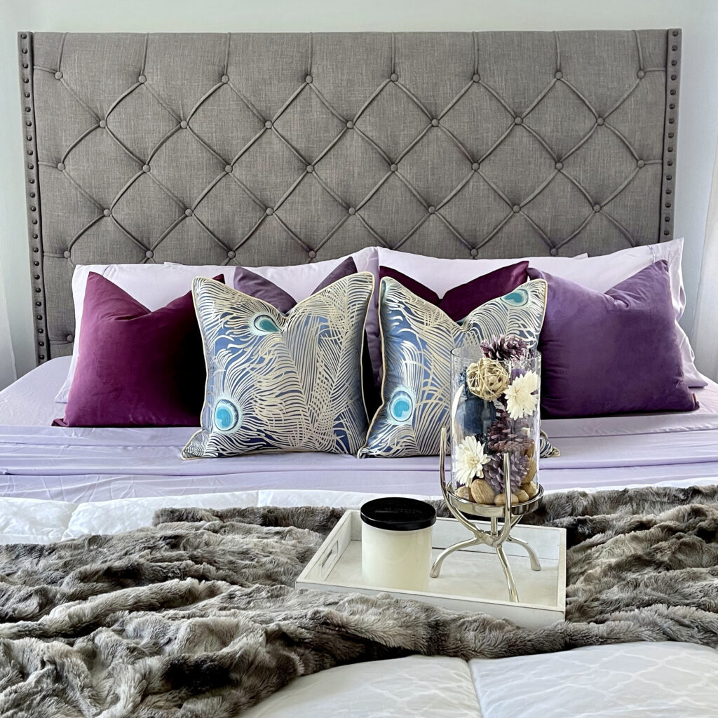
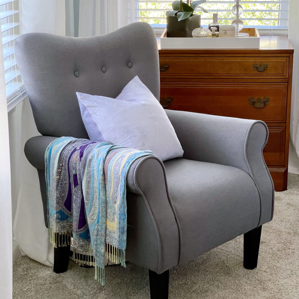
I decided to step out of my color comfort zone and give our master bedroom a quick refresh using some Very Peri decor elements. And, as per usual, I put together a mood board to help organize my ideas… and budget.
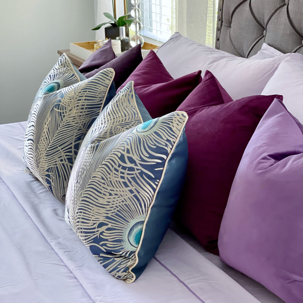
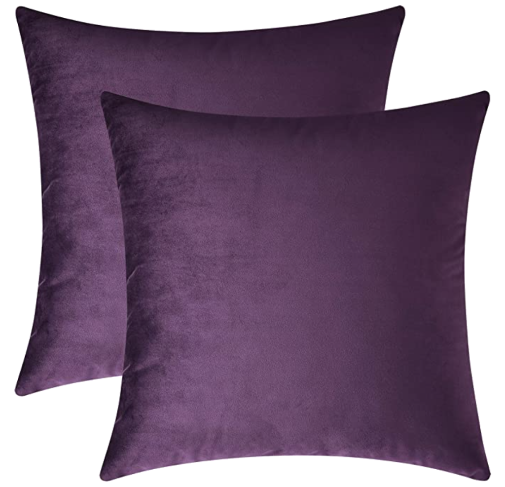
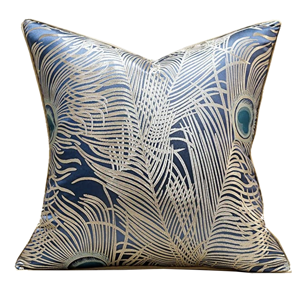
Very Peri can be introduced through different materials, textures and finishes, from a painted or papered wall, velvet or silk throw pillow covers, lacquered vases, flowers or accent furniture, all layered to create an eye-catching look.
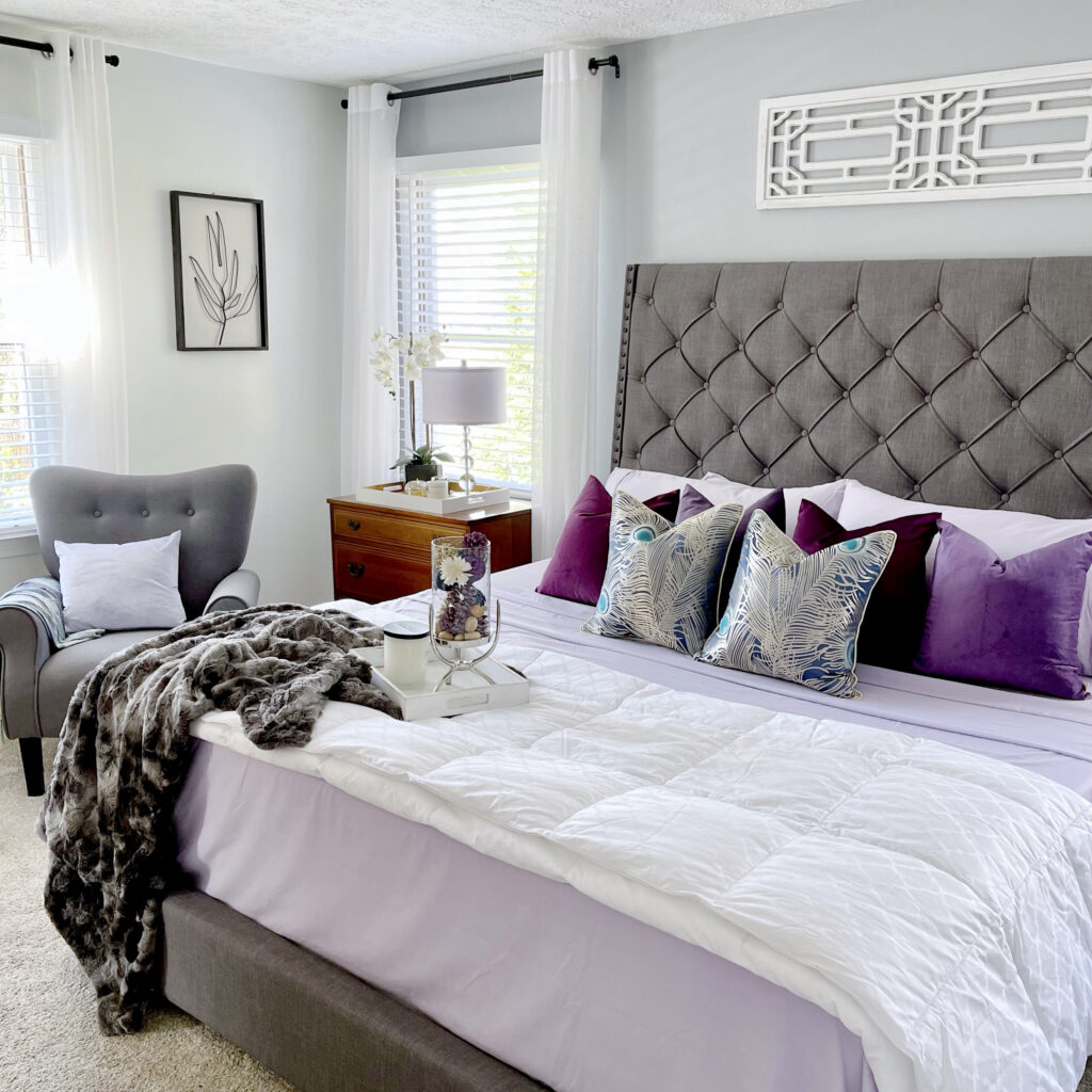
If your home has varying shades of grey like mine, Very Peri is the perfect complement to update it and bring it life! The versatility of grey goes with just about any color, and pairs beautifully with these purple and blue hues. And while I added “color” to our bedroom, it still has a neutral, harmonious and calming feel.
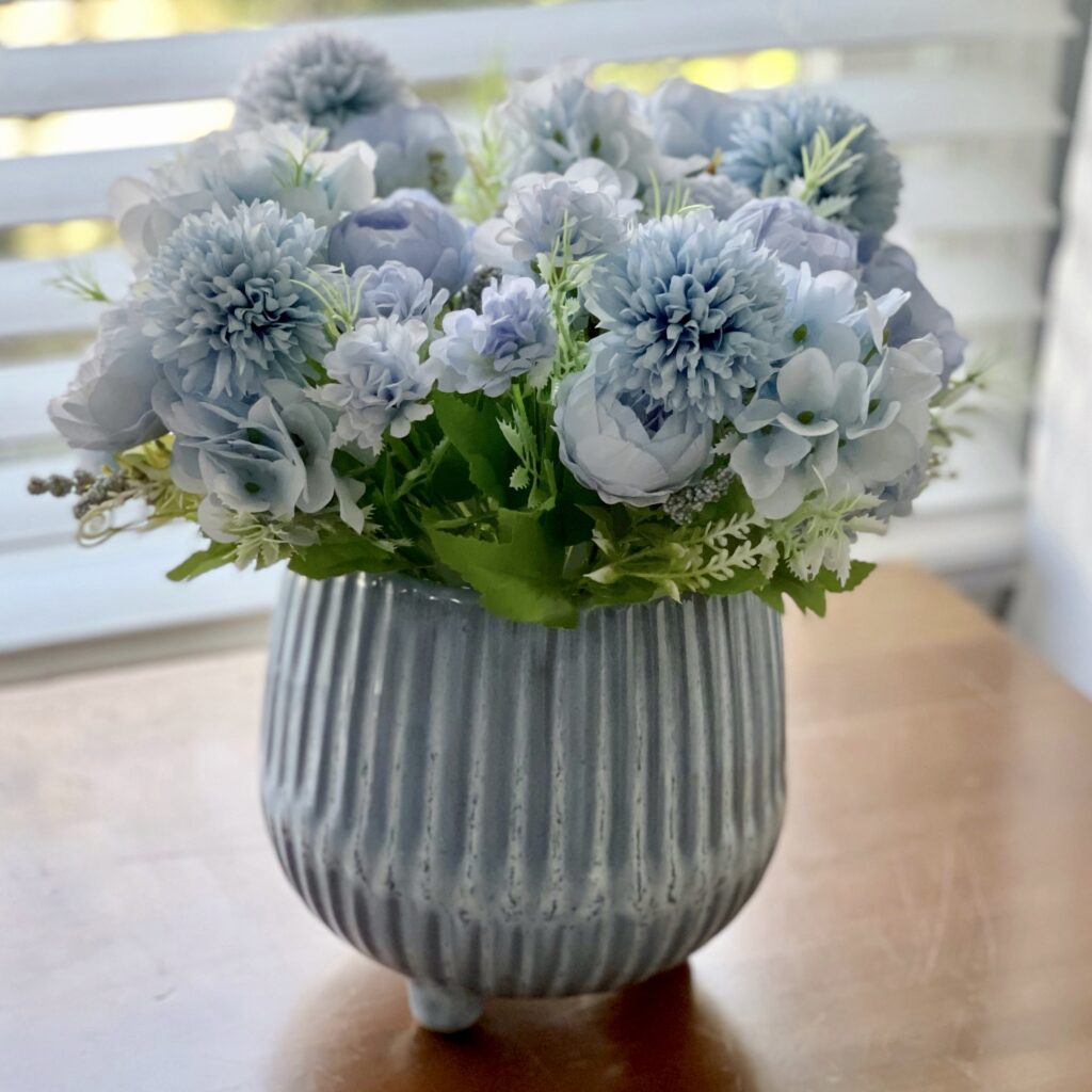
I’d also recommend adding some greenery to your decor. Whether faux or real, plants seem to create balance and add a different layer of texture to any space.

And, while I chose a tonal palette of reddish plums, violet, lavender, blueish tones to punch up the periwinkle, you can select brighter colors for a sharp contrast. If you’re not afraid of color, try deep oranges, muted teals and dark yellows to create a bolder palette to complement your Very Peri decor.
If you’re feeling extra BOLD, try painting the front door in Very Peri!
Shop Now!


I’m so glad you stopped by! Be sure to check in weekly on this blog for updates and also catch up on my daily lifestyle and home decor tips by following me on the gram @thefarafix

These colors are just gorgeous!